
https://chakra-ui.com/community/recipes/floating-labels
Chakra UI - A simple, modular and accessible component library that gives you the building blocks you need to build your React a
Simple, Modular and Accessible UI Components for your React Applications. Built with Styled System
chakra-ui.com
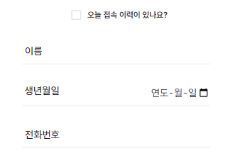
이 디자인을 로그인화면에 input으로 넣고 싶었다.
그래서 하나의 컴포넌트로 만들어서, 계속 재사용할 수 있도록 만들어보았다.
provider.tsx
"use client";
import * as React from "react";
import { ChakraProvider } from "@chakra-ui/react";
import theme from "../theme";

export default function Provider({ children }: { children: React.ReactNode }) {
  return <ChakraProvider theme={theme}>{children}</ChakraProvider>;
}
혹시 이렇게 해서 안되면, chakra-ui/next-js를 깔고 아래처럼 CacheProvider를 감싸주는것도 방법이다.
근데 나는 위 코드 만으로도 되었음.
"use client";
import * as React from "react";
import { CacheProvider } from "@chakra-ui/next-js";
import { ChakraProvider } from "@chakra-ui/react";
import theme from "../theme";

export default function Provider({ children }: { children: React.ReactNode }) {
  return (
    <CacheProvider>
      <ChakraProvider theme={theme}>{children}</ChakraProvider>;
    </CacheProvider>
  );
}
layout.tsx
import Provider from "@/utils/provider";
import type { Metadata } from "next";
import "./globals.css";

export const metadata: Metadata = {
	title: "Create Next App",
	description: "Generated by create next app",
};

export default function RootLayout({
	children,
}: Readonly<{
	children: React.ReactNode;
}>) {
	return (
		<html lang="ko">
			<body className={inter.className}>
				<Provider>{children}</Provider>
			</body>
		</html>
	);
}
layout 파일에 와서 provider를 감싸주면 일단 준비 끝이다!
위의 chakra ui 링크에 있는 코드를 theme.ts로 끌고 오장
theme.ts
import { extendTheme, Input, Select, Textarea } from "@chakra-ui/react";

const activeLabelStyles = {
	transform: "scale(0.85) translateY(-24px)",
};
const theme = extendTheme({
	components: {
		Form: {
			variants: {
				floating: {
					container: {
						_focusWithin: {
							label: {
								...activeLabelStyles,
							},
						},
						"input:not(:placeholder-shown) + label, .chakra-select__wrapper + label, textarea:not(:placeholder-shown) ~ label":
							{
								...activeLabelStyles,
							},
						label: {
							top: 0,
							left: 0,
							zIndex: 2,
							position: "absolute",
							backgroundColor: "transparent",
							pointerEvents: "none",
							mx: 0,
							px: 1,
							my: 2,
							transformOrigin: "left top",
						},
					},
				},
			},
		},
	},
});

Input.defaultProps = { ...Input.defaultProps, focusBorderColor: "#3eb134" };
Select.defaultProps = { ...Select.defaultProps, focusBorderColor: "#3eb134" };
Textarea.defaultProps = { ...Textarea.defaultProps, focusBorderColor: "#3eb134" };

export default theme;
마지막 defaultProps 있는 줄은, 이 프로젝트가 전반적으로 초록색을 띄고 있어서
input, select, textarea색상을 초록색 계열로 맞춰준부분이다
FloatingLabel.tsx
import React from "react";
import {
	FormControl,
	FormErrorMessage,
	FormHelperText,
	FormLabel,
	Input,
	Select,
} from "@chakra-ui/react";

interface FloatingInputProps {
	id?: string;
	placeholder?: string;
	type?: string;
	label?: string;
	helperText?: string;
	errorMessage?: string;
	children?: React.ReactNode;
	disabled?: boolean;
}

const FloatingInput = ({
	id,
	placeholder,
	type,
	label = "",
	helperText,
	errorMessage,
	children,
	disabled,
	...rest
}: FloatingInputProps) => {
	return (
		<FormControl variant="floating" id={id} isInvalid={!!errorMessage}>
			<Input
				variant="flushed"
				type={type}
				placeholder={placeholder}
				disabled={disabled}
				textAlign={type === "date" ? "right" : "left"}
				pl={"5px"}
			/>
			{type === "date" ? (
				<FormLabel color={disabled ? "gray.300" : "gray.800"} fontSize="19px" pt={"20px"}>
					{label}
				</FormLabel>
			) : (
				<FormLabel color={disabled ? "gray.300" : "gray.800"}>{label}</FormLabel>
			)}
			<FormHelperText>{helperText}</FormHelperText>
			<FormErrorMessage>{errorMessage}</FormErrorMessage>
		</FormControl>
	);
};

export default FloatingInput;
이제 불러와서 써주면 된다.
type 이 date인 것을 따로 조건처리 해준 이유는, date일때 label이 상단에 고정이 돼서 디자인을 바꿔줘야해서 그렇다.
export const userLoginInputFields: IInputFields[] = [
	{
		id: "userId",
		placeholder: " ",
		type: "input",
		label: "아이디",
	},
	{
		id: "passwd",
		placeholder: " ",
		type: "password",
		label: "비밀번호",
	},
];이런식으로 각자 페이지에서 쓸 input list들을 한곳에 담아두고,
Login.tsx (예시 페이지- 실제로 사용할 페이지)
<LoginBox>
    <form onSubmit={handleSubmit(onLogin)}>
        <Flex
            w={"full"}
            h={"130px"}
            flexDirection={"column"}
            justifyContent="space-between"
            mt={"30px"}
            px="10px"
        >
            {userLoginInputFields.map((el: any) => (
                <FloatingInput
                    key={el.id}
                    {...el}
                    type={el.type}
                    {...register(el.id, { required: true })}
                />
            ))}
        </Flex>
        <MainBtn onClick={() => router.push("/")} title={"LOGIN"} size={"sm"} />
    </form>
    <Box w={"full"} mt="30px">
        {userLoginLinkList.map((el: any) => (
            <MainLinks url={el.url} content={el.content} />
        ))}
    </Box>
</LoginBox>
이런식으로 써주면 된다.
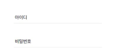
이렇게 잘 반영된 것을 볼 수 있음!
'Coding Diary' 카테고리의 다른 글
| 다음 주소 검색 api 이용해서 next 에 적용하기 (+모달) (0) | 2024.04.02 |
|---|---|
| [Next] SNS별로 동적라우팅(Dynamic Routes) 지정하기 (1) | 2024.03.05 |
| [JS, React] 페이징 처리 시 인덱스를 역순으로 처리 (2) | 2023.11.27 |
| Ag-grid에 숫자만 입력되게 하기 : agNumberColumnFilter (0) | 2023.10.02 |
| Check Box 이용해서 Select option 값 변경하기 (0) | 2023.09.22 |